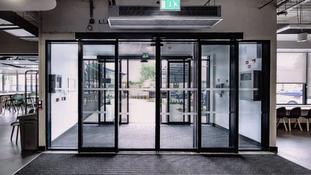
You have roughly seven seconds to make a first impression. When a potential client or customer walks toward your building, they are already making judgments about your professionalism, your brand identity, and the quality of your services. Before they even shake your hand or speak to a receptionist, your environment has done the talking for you.
For commercial spaces, signage is the most critical element of this visual dialogue. It serves a dual purpose: functional navigation and brand reinforcement. A well-executed sign strategy transforms a generic office or retail outlet into a cohesive brand experience. Conversely, poor, outdated, or confusing signage can signal neglect or lack of attention to detail.
Investing in high-impact sign solutions is not merely about aesthetics; it is a strategic business move. Whether you are outfitting a corporate headquarters, a boutique retail store, or a bustling medical complex, the right visual communication tools can elevate your presence and improve the customer journey.
The Silent Salesperson: Why Signage Matters
Think of your signage as a silent salesperson that never clocks out. It works around the clock to communicate who you are. Effective commercial signage builds trust instantly. When a customer sees high-quality materials and thoughtful design, they subconsciously associate those traits with your business operations.
Beyond branding, signage reduces anxiety. We have all experienced the frustration of entering a large complex and not knowing where to go. Clear, authoritative directional signage puts visitors at ease. When people feel comfortable and oriented, they are more open to doing business.
Material Selection: Conveying Character
The physical material of your sign says just as much as the words written on it. Matching the material to your brand ethos is essential for a consistent narrative.
Metal and Architectural Finishes
For law firms, financial institutions, and corporate offices, metal finishes often reign supreme. Brushed aluminum, stainless steel, or brass convey stability, longevity, and strength. These materials are often used for dimensional lettering in lobbies, providing a 3D effect that catches the light and adds depth to a reception wall.
The Versatility of Acrylic
If your brand leans towards modern, tech-forward, or creative, you might require something more adaptable. This is where acrylic signage shines. It offers a glass-like elegance without the weight or fragility of actual glass. It can be clear, frosted, or colored to match specific pantones, making it incredibly versatile for lobby signs, wayfinding plaques, and standoff displays. Because it can be laser-cut into intricate shapes and is highly durable, it remains a top choice for businesses wanting a sleek, contemporary look.
Wood and Organic Elements
Brands focusing on sustainability, wellness, or artisanal products often turn to wood. Reclaimed timber or clean-cut oak can add warmth and approachability to a space, softening the corporate edge and inviting customers to relax.
Lighting the Way: Illumination Strategies
Visibility is the currency of physical marketing. If your sign disappears when the sun goes down, you are losing half your audience. Modern illumination techniques have moved far beyond the buzzing neon of the past.
Halo-Lit Lettering: This technique involves placing LED lights behind the letters, projecting a glow onto the wall behind them. It creates a sophisticated, silhouette effect that is easy on the eyes and highly legible. It is a popular choice for upscale retail and evening-focused venues.
Face-Lit Channel Letters: This is the standard for exterior retail signage. The letters themselves light up, ensuring the brand name is the brightest thing on the block. It projects confidence and boldness.
Digital Displays: For high-traffic areas, static signs are sometimes replaced or augmented by digital solutions. LED video walls or digital kiosks allow businesses to change messaging in real-time, promoting daily specials, welcoming specific guests, or displaying portfolio work.
Strategic Placement and Scale
A beautiful sign placed in the wrong spot is a wasted investment. Scale and perspective determine impact. A common mistake in commercial spaces is underestimating the size required for readability.
For exterior monuments or building-mounted signs, you must consider the speed of passing traffic. A sign meant to be read from a highway needs to be significantly larger than one viewed by pedestrian traffic.
Inside, placement is about eye level and decision points. Signs should be located at “forks in the road”—elevators, hallway intersections, and entryways. The goal is to provide information exactly when the visitor asks the question, “Where do I go next?”
Inclusivity Through Design
High-impact signage must also be accessible. In many jurisdictions, compliance with the Americans with Disabilities Act (ADA) or similar local laws is mandatory. However, good design goes beyond doing the bare minimum for compliance.
High-contrast text, tactile Braille characters, and non-glare finishes ensure that your commercial space is welcoming to everyone, including those with visual impairments. Integrating these requirements into your brand’s aesthetic requires skill, but the result is a space that signals inclusivity and care.
Investing in Your Visual Identity
Upgrading your signage is one of the most cost-effective renovations you can undertake. You don’t always need to knock down walls to change the feel of a commercial space; sometimes, you just need to change the labels.
From the commanding exterior monument that marks your territory to the subtle wayfinding markers that guide a client to a conference room, every sign is a touchpoint. By choosing the right materials, utilizing smart illumination, and prioritizing clarity, you ensure that your business makes an impact that lasts long after the visitor leaves.


